
User interface themes and theme editor
User interface themes
User interface themes are sets of resources and settings allowing to change the appearance of the user interfaces of your applications. A number of interface plugITs allow you to change their appearance, but using a theme has several advantages:
- The theme sets the resources used by default, allowing you to modify the interfaces without appearance parameters (dialogs for example).
- Using theme settings in plugITs eliminates the need to manually change resources in each plugIT to have a homogeneous user interface.
- It is easier to switch between different appearances in an application (with a light theme and a dark theme for example).
- The theme allows further customization of all interface elements.
- Overall, it's an easier, more complete, safer, and automated way to achieve a consistent user interface.
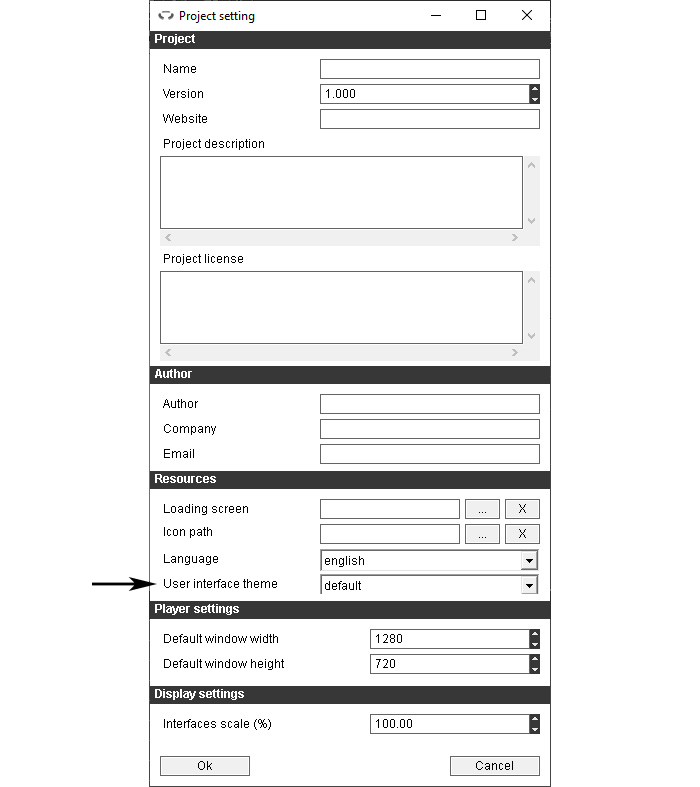
To change the theme of the open project, click the "Project Settings" icon 
In the "Resources", section, select the desired theme in "User interface theme":
Theme editor
To open the theme editor click the "Theme editor" icon 
Create a new theme
In the theme editor, click the "New theme" icon 
The following window will open:
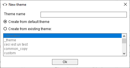
The first field is used to enter the name of the new theme. It is obligatory and must not be identical to that of an existing theme.
It is then possible to choose whether the new theme will be based on the default theme of OpenSpace3D, or whether it will be a copy of another existing theme.
Open a theme
In the theme editor, click the "Open theme" icon 
The following window will open:
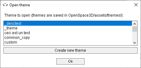
It displays the list of available themes. Select the theme to open and click Ok to open it.
The themes are all saved in a folder with their name, itself in the folder OpenSpace3D/assets/themes. All the resources needed for a theme are contained in this folder,
so you can easily share a theme with other machines simply by copying the theme folder into OpenSpace3D/assets/themes.
Save a theme
In the theme editor, click the "Save theme" icon 
n some cases, the following window will open:
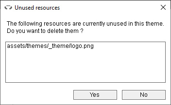
This is the list of images in the theme folder that are not used by any element of the theme. If you click yes, the files listed will be deleted. If you click no, they will be kept and the theme will still be saved.
Theme elements
A theme is composed of several elements, grouped into categories called "definitions". groups the main elements of interfaces such as backgrounds, buttons, main writing fonts ...
The other definitions correspond to elements that require multiple resources, such as lists which are composed of a background, selectable items and, if necessary,
a button for unfolding it.
Another special definition is the "custom" definition, which groups every additional elements created or duplicated.
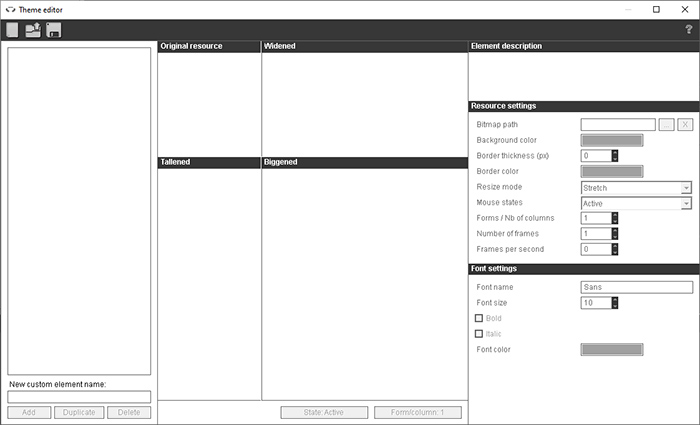
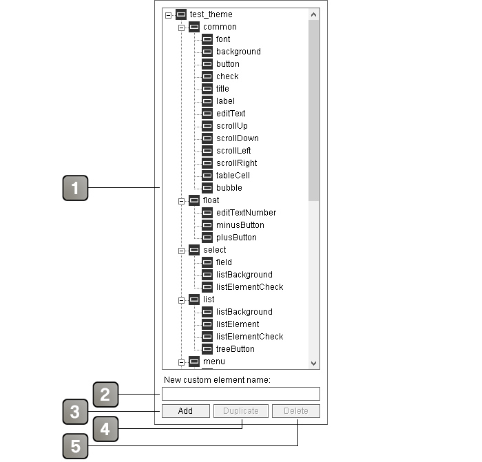
On the left of the theme editor is the list of elements of the currently open theme, which allows you to browse, add, duplicate, or delete these elements.
Interface description |
|
1 |
List of open theme elements. Click an element in this list to see its preview and change its settings. |
2 |
Text field to enter the name of a new theme element. |
3 |
Adds a new theme element. This element will be added in the "custom" definition. |
4 |
Duplicates the selected element or definition. A dialog box will ask to enter the new name of the duplicated element. Duplicated elements appear in the "custom" definition. Duplicated definitions are automatically prefixed by the name of the original definition. The "common" and "custom" definitions can not be duplicated. |
5 |
Deletes the selected item or definition. Basic elements and definitions can not be deleted, as well as elements within a duplicated definition. |
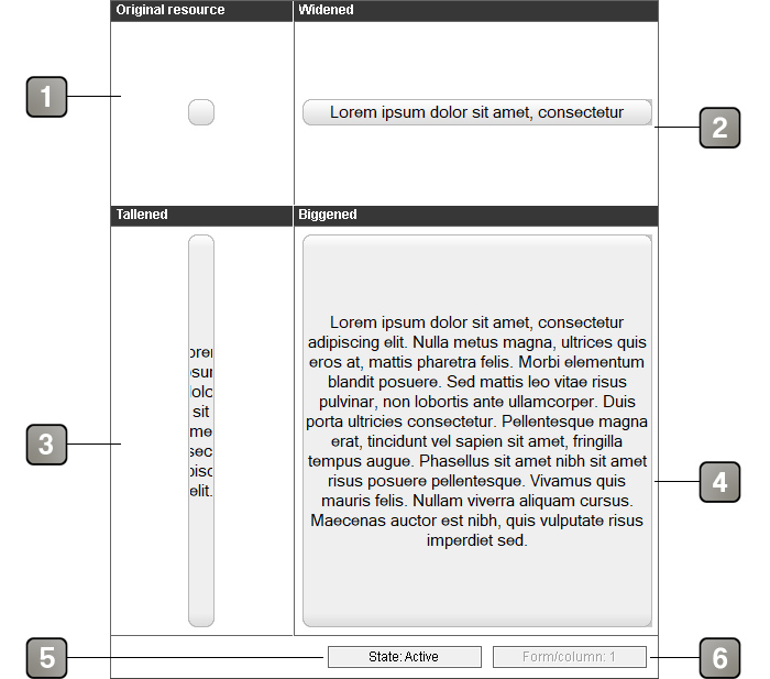
In the center of the editor is the preview of the currently selected element. It allows to get an idea of the final appearance of the element, to see its different states and forms, as well as to see its animation in motion if it has one.
Interface description |
|
1 |
Original resource, undeformed. |
2 |
Resource enlarged horizontally, with a short sample text with the selected font settings. |
3 |
Resource enlarged vertically, with a short sample text with the selected font settings. |
4 |
Resource enlarged horizontally and vertically, with a long example text with the selected font settings. |
5 |
Button to see the different states of the resource. |
6 |
Button to see the different forms of the resource. |
On the right side of the editor are the element settings. They allow to see and modify the parameters of the element currently selected in the list.
An element is composed of a graphic resource and / or a writing font, both with a number of options:
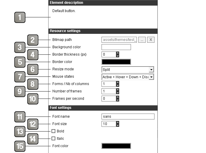
Interface description |
|
1 |
Description of the element, where it is used and what it is supposed to represent. For added or duplicated elements, it is possible to write its own description. |
2 |
The path of the image used for the resource. The selected image will be copied to the theme folder (OpenSpace3D/assets/themes/[theme name]) if it is not already there. If the selected image is not in the theme folder and has the same name as an already existing image, the following window will appear: 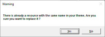 Answering yes will delete the image already present and replace it with the new image. Warning, this can affect other elements of the theme that used the previous image. |
3 |
Background color. Used only if the image path is empty. The alpha parameter defines transparency, from 0 (transparent) to 127 (opaque). |
4 |
Thickness of the border in pixels. To avoid having a border, set to 0. |
5 |
Color of the border. The alpha parameter defines transparency, from 0 (transparent) to 127 (opaque). |
6 |
Resize mode of the image. - Stretch : Deforms the image to fit the size of the element - Split : Splits the image in 4 and rebuild it to the correct size - Fit : Fit the resource in the content size - Fill : Duplicate the ressource to fill the content size - Cover : Fit the resource in the content size keeing the ratio Various examples (in order: original resource / enlarged and splited / enlarged and stretched / reduced and splited / reduced and stretched): 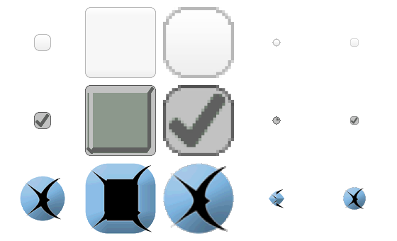 |
7 |
The different states that the resource can take. - Active: normal state of the resource - Hover: state of the resource when the mouse is over it - Down: state of the resource when it is clicked - Disabled: state of the resource when the element is disabled The different states must be included on top of each other in the resource. This will be divided vertically in X part corresponding to the number of state chosen. Resource example for a button with the 4 states (Active + hover + down + disabled): 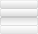 |
8 |
Number of forms of the resource. Notably used on checkboxes for forms "unchecked" and "checked" and on selectable list elements for forms "normal" and "selected". The different forms must be included next to each other in the resource. This will be divided horizontally into X part corresponding to the number of forms chosen. Resource example for a checkbox with two forms ("unchecked" and "checked") and two states (Active + hover):  |
9 |
Number of frames present in the resource if it is an animated resource.
The different frames of the animation must be included next to each other in the resource. This will be divided horizontally into X part corresponding to the number of frames defined. Example of an animated image with three states on the height (Active, hover and down) and eight frames for the animation. 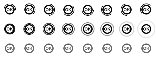 |
10 |
Animation speed in frames per second. |
11 |
Padding (l r t b) : Padding en pixels pour gauche, droite, haut, bas. |
12 |
Font type to add or remove font effect on state change. |
13 |
Name of the writing font used. |
14 |
Size of the writing font. |
15 |
If checked and if the writing font is compatible, use the bold version of the font. |
16 |
If checked and if the writing font is compatible, use the italic version of the font. |
17 |
Color of the writing font. |
18 |
Event type to trigger a sound on the UI. |
19 |
Sound file path of the event. |
20 |
Sound volume of the event. |
21 |
Sound playback bar for tests. |