
Back to Interface PlugITs content page
"Menu" PlugIT
The "Menu" PlugIT allows to create a configurable menu for the user interface, to display in the 3D world or to display on an object.
Parameters |
|
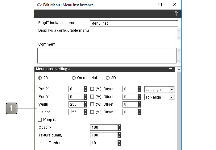
1 |
Parameters of the area occupied by the menu. Warning : the dimensions of this area must include the size of the unfoldable menus For more details, please refer to the interface positioning documentation. |
Parameters (next) |
|
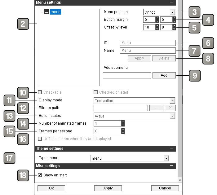
2 |
Hierarchy of the menu. the first node is the root of the menu and will not be displayed. The nodes children of the root will be the menu buttons. The nodes children of the buttons will be the unfoldable menus elements. Hierarachy exemple : 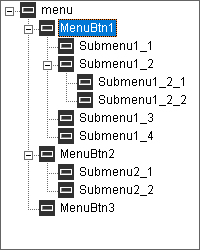 |
3 |
Menu alignment in the menu area. The unfoldable menus will open on the side opposite to the alignment. |
4 |
Horizontal and vertical margins between the buttons in pixels. |
5 |
Offset between two differents levels in the hierarchy. |
6 |
Identifier of the selected element. It is automatically generated at the element's creation and will be used to refer to this element in the event. Warning : Two elements cannot have the same identifier. Also modifying the identifier of an element will destroy all plugIT links already created with an event related to this identifier. |
7 |
Name of the selected element as it will appear in the application. |
8 |
Button allowing to apply the changes of identifier and / or name, and button allowing to delete the selected element. |
9 |
Allows to add an element to the menu as a child of the currently selected element. |
10 |
Define if the selected element is checkable. The second checkbox allows to define if the element is checked by default. Available only on the unfoldable menus elements. |
11 |
Define the display mode of the selected menu button. Available only on menu button elements. The text mode display the button with its name in the center. The pictogram mode displays the button without text with its name in a bubble that appear on hover. |
12 |
Path of the picture used for the selected menu button. if empty a default picture will be used. Available only on menu button elements. |
13 |
Allows to choose the differents states of the selected menu button. Warning : depending on the states, your picture will not be used in the same way. It will be divided in X parts on the height, X corresponding to the number of states chosen. |
14 |
Allows to define the number of pictures of your menu button if it is an animated button. The number of pictures of the animation is defined on the width of the picture. Example of an animated picture with three states on the height (Active, hover and Down) and eight pictures for the annimation. 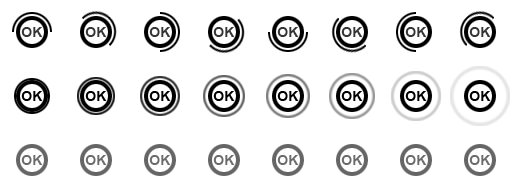 |
15 |
Speed of the animation of the menu button, in frames per second. |
16 |
If checked, the children of the unfoldable menu elements will be unfolded by default. |
17 |
Theme element selector. For more details, please refer to the theme element selector documentation. |
18 |
Show / hide the menu on application startup. |
Action |
|
X > Y check |
Allows to check an unfoldable menu element. |
X > Y uncheck |
Allows to uncheck an unfoldable menu element. |
Hide |
Hides the menu. |
Show |
Shows the menu. |
Event |
|
X
|
Triggered when the corresponding menu button or unfoldable menu element is clicked. The displayed names are the identifiers of the elements. |
X checked
|
Triggered when the corresponding unfoldable menu element is checked. |
X unchecked
|
Triggered when the corresponding unfoldable menu element is unchecked. |
Shown |
Triggered when the menu is shown. |
Hidden |
Triggered when the menu is hidden. |