
Back to Interface PlugITs content page
"Custom interface" PlugIT
The "Custom interface" PlugIT allows to create a fully customizable user interface.
Parameters |
|
1 |
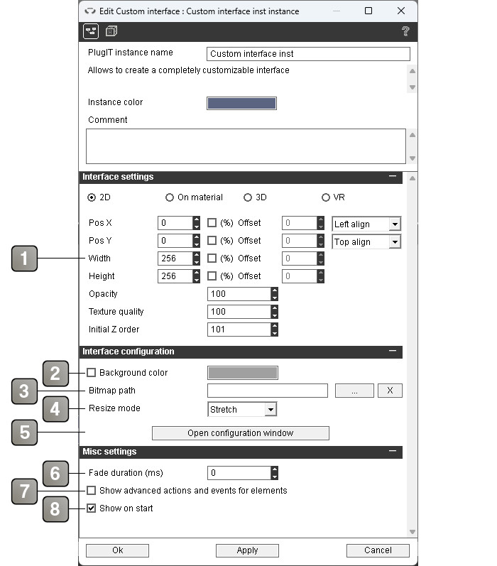
Interface positioning and size parameters. For more details, please refer to the interface positioning documentation. |
2 |
If checked, a selectable solid color will be used for the interface background. |
3 |
Path of the image used as the interface background. If left blank, the theme's default background image will be used. |
4 |
Resize mode of the background picture. - Stretch: Deform the picture to fit the size of the element - Split: Split the picture in 4 and rebuilds it with the correct size - Fit: Fit the picture to the view while keeping aspect ratio |
5 |
Button to open the window allowing to customize the interface. |
6 |
Fade duration in milliseconds on show or hide. |
7 |
If checked, the advanced actions and events of each element of the interface will be available. |
8 |
Show / hide the interface on application startup. |
Action |
|
Reset |
Allows to reset the interface to its initial state. |
Reset element |
Allows to reset a single element of the interface to its initial state. |
Hide |
Hides the interface. |
Show |
Shows the interface. |
Event |
|
Shown |
Triggered when the interface is shown. |
Hidden |
Triggered when the interface is hidden. |
Configuration window
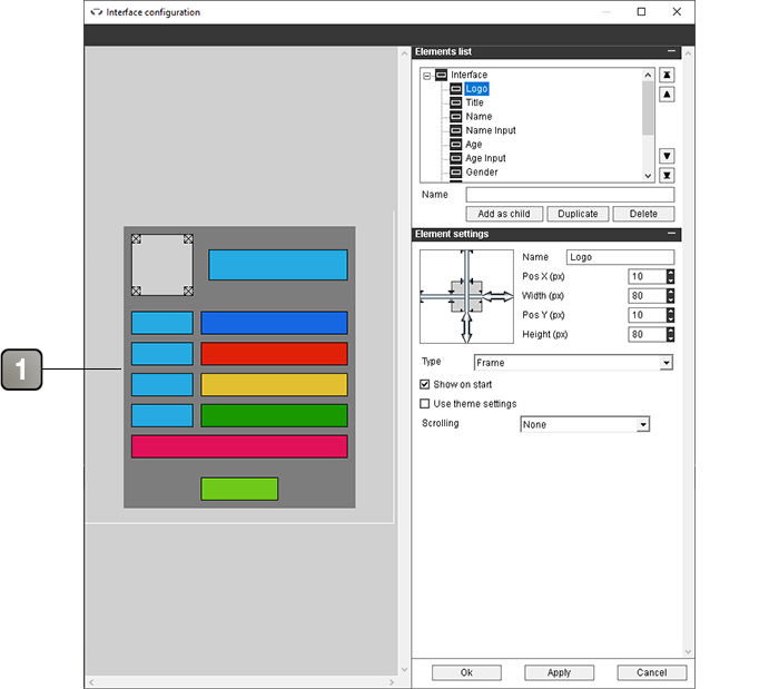
The interface configuration window allows you to configure the interface by adding and arranging the elements you want to use.
If you chose an interface size in percent, you can resize the window to see how your interface looks for different dimensions.
Parameters |
|
1 |
This area represents your interface. You can select and move your elements freely with the mouse and resize them using the arrows at the four corners of the selected element. |
Parameters (next) |
|||||||
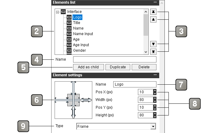
2 |
List of elements present in the interface. You can select the element to edit from this list. It is possible to change the parent of an element by dragging this element onto its new parent. A click of the central mouse button hides / displays an element (during editing only). | ||||||
3 |
Buttons to move the selected element in the list. From top to bottom: move all the way up, move one notch up, move one notch down, move all the way down. | ||||||
4 |
The name of the element to add. | ||||||
5 |
- Add as child : Adds an element to the interface, as a child of the selected element. To add it to the root of the interface, select "Interface". A unique name must be entered in the "Name" field. - Duplicate : Duplicates the selected element. - Delete : Deletes the selected element. |
||||||
6 |
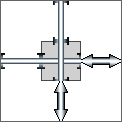
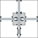
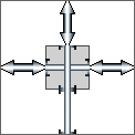
Allows to define the position and relative dimension of the selected element as well as its behavior when the interface changes size. The symbols outside the gray area represent the distance between the element and each of its parent's edges. The symbols inside the gray area represent the width and height of the element. An arrow means that the dimension is variable, a line means that the dimension is fixed (in pixels). You can change each symbol by clicking on it. Examples :
|
||||||
7 |
Name of the element. Can be modified, but each element of the interface must have a unique name. | ||||||
8 |
Element position and size settings. They change according to the parameters selected in (5). The dimensions can be in pixels (px) or in percent relative to the size of the parent (%). - Pos X : position relative to the left edge of the parent - Width : width of the element - Pos X2 : position relative to the right edge of the parent - Pos Y : position relative to the top edge of the parent - Height : height of the element - Pos Y2 : position relative to the bottom edge of the parent |
||||||
9 |
The type of the element. Each element type has its own parameters and properties, described below. | ||||||
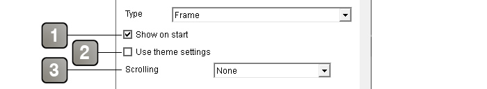
"Frame" type
An element of type "Frame" is an empty element. It is useful for prioritizing the other elements and for the elements that must be hidden and displayed since it is the only element with the "Show" and "Hide" actions.
Parameters |
|
1 |
If checked, the element is visible in the interface on startup. |
2 |
If checked, brings up a theme element selector to use theme elements to make the frame element visible.. For more details, please refer to the theme element selector documentation. |
3 |
Allows to enable the horizontal and / or vertical scrolling in the frame. |
Action |
|
Hide [element name] |
Hide the element and all its children. |
Show [element name] |
Shows the element and all its children. |
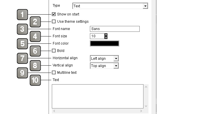
"Text" type
A "Text" element is used to display text on the interface.
Parameters |
|
1 |
If checked, the element is visible in the interface on startup. |
2 |
If checked, allows you to use theme elements instead of the plugIT parameters. Other appearance settings will be replaced by a theme element selector. For more details, please refer to the theme element selector documentation. |
3 |
Name of the text font. |
4 |
Size of the text font. |
5 |
Text color. |
6 |
Bold font. |
7 |
Horizontal alignment of the text. |
8 |
Vertical alignment of the text. |
9 |
If checked, the text can be displayed on multiple lines if it exceeds the length of the element. |
10 |
Text content. |
Action |
|
Set [element name] text |
Change the text content of the element. |
Hide [element name] |
Hide the element and all its children. |
Show [element name] |
Shows the element and all its children. |
"Text input" type
A "Text input" element displays a text input field for the user on the interface.
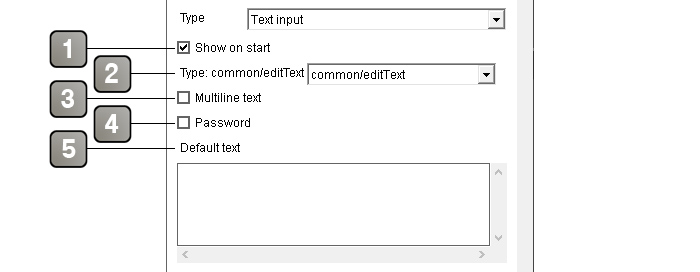
Parameters |
|
1 |
If checked, the element is visible in the interface on startup. |
2 |
Theme element selector. For more details, please refer to the theme element selector documentation. |
3 |
If checked, the text can be displayed on multiple lines if it exceeds the length of the element. |
4 |
If checked, the text will appear as "*". Useful to make a password field. |
5 |
Default text. |
Action |
|
Get [element name] text |
Retrieves the text content of the element. |
Set [element name] text |
Change the text content of the element. |
Hide [element name] |
Hide the element and all its children. |
Show [element name] |
Shows the element and all its children. |
Disable [element name] |
Disable the element, so that it is no longer possible to interact with it. |
Enable [element name] |
Activate the element, so that it is possible to interact with it. |
Event |
|
[element name] content |
Returns the text content of the element. Can be triggered by the "Get [element name] text" action or a button with the "Validation button" preset. |
"Button" type
A "Button" element is a clickable button with optional text on it.
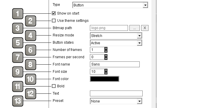
Parameters |
|
1 |
If checked, the element is visible in the interface on startup. |
2 |
If checked, allows you to use theme elements instead of the plugIT parameters. Other appearance settings will be replaced by a theme element selector. For more details, please refer to the theme element selector documentation. |
3 |
Path of the picture file. |
4 |
Resize mode of the picture. - Stretch: Deform the picture to fit the size of the element - Split: Split the picture in 4 and rebuilds it with the correct size - Fit: Fit the picture to the view while keeping aspect ratio |
5 |
Allows you to choose state of your button. Depending on the states, your image won't be used as the same way. Your image will be divided by N parts relative to the choosing state number on the image height. |
6 |
Allows to define the number of frame of your button if it is an animated button. The number of frame of the animation is defined on the image's width. Example of an animated image with three states on the height (Active, hover and down) and eight frames for the animation. 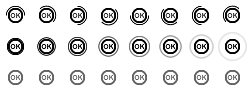 |
7 |
Animation speed in frames per second. |
8 |
Name of the text font. |
9 |
Size of the text font. |
10 |
Text color. |
11 |
Bold font. |
12 |
Optional text displayed on the button. |
13 |
Type of preset that affects the effects of the button when it is clicked: - None: Triggers only the "[element name] clicked" event - Validation button: Triggers the event "[element name] clicked" as well as the events allowing to retrieve the content of the other elements of the interface |
Action |
|
Set [element name] text |
Change the text content of the element. |
Set [element name] picture path |
Change the path of the picture to use. |
Hide [element name] |
Hide the element and all its children. |
Show [element name] |
Shows the element and all its children. |
Disable [element name] |
Disable the element, so that it is no longer possible to interact with it. |
Enable [element name] |
Activate the element, so that it is possible to interact with it. |
Event |
|
[element name] clicked |
Triggered when the button is clicked. |
"Number" type
A "Number" element is used to display a number input field for the user on the interface.
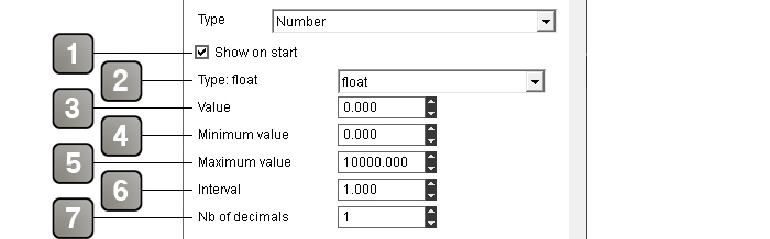
Parameters |
|
1 |
If checked, the element is visible in the interface on startup. |
2 |
Theme element selector. For more details, please refer to the theme element selector documentation. |
3 |
Default value. |
4 |
Minimum value that can be entered in the field. |
5 |
Maximum value that can be entered in the field. |
6 |
Value added or subtracted when the increment or decrement button is used. |
7 |
Number of decimals of the value. |
Action |
|
Get [element name] value |
Retrieves the value of the element. |
Set [element name] value |
Change the value of the element. |
Hide [element name] |
Hide the element and all its children. |
Show [element name] |
Shows the element and all its children. |
Event |
|
[element name] value |
Returns the value of the element. Can be triggered by the "Get [element name] value" action or a button with the "Validation button" preset. |
[element name] modified |
Triggered when the element value changes. Contains the new value in the link parameter. |
"Select" type
An element of type "Select" is a drop-down list. The user can only select one option from the list.
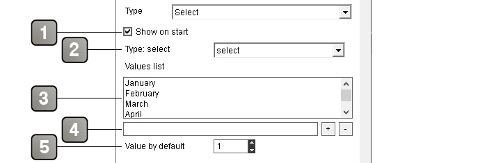
Parameters |
|
1 |
If checked, the element is visible in the interface on startup. |
2 |
Theme element selector. For more details, please refer to the theme element selector documentation. |
3 |
List of values in the drop-down list. |
4 |
Allows to add a value to the list of values. The "+" button adds the value to the list, the "-" button deletes the value selected in the list. |
5 |
Position in the list of the default value of the "select" element. |
Action |
|
Get [element name] value |
Retrieves the value selected in the "select" element. |
Get [element name] position |
Retrieves the position in the list of the value selected in the "select" element. |
Hide [element name] |
Hide the element and all its children. |
Show [element name] |
Shows the element and all its children. |
Event |
|
[element name] value |
Returns the value selected in the "select" element. Can be triggered by the "Get [element name] value" action or a button with the "Validation button" preset. |
[element name] position |
Returns the position in the list of the value selected in the "select" element. Can be triggered by the "Get [element name] position" action or a button with the "Validation button" preset. |
"Checkbox" type
A "Checkbox" item displays a checkbox with optional text on the interface.
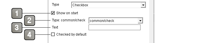
Parameters |
|
1 |
If checked, the element is visible in the interface on startup. |
2 |
Theme element selector. For more details, please refer to the theme element selector documentation. |
3 |
Text displayed to the right of the checkbox (optional). |
4 |
If checked, the checkbox will be checked by default on the interface. |
Action |
|
Get [element name] state |
Retrieves the state of the checkbox. |
Set [element name] state |
Change the state of the checkbox with the value in the link parameter (1 for checked, 0 for unchecked). |
Set [element name] text |
Change the text content of the element. |
Hide [element name] |
Hide the element and all its children. |
Show [element name] |
Shows the element and all its children. |
Event |
|
[element name] state |
Returns the state of the checkbox (1 for checked, 0 for unchecked). Can be triggered by the "Get [element name] state" action or a button with the "Validation button" preset. |
[element name] checked |
Triggered when the box is checked. |
[element name] unchecked |
Triggered when the box is unchecked. |
"Picture" type
An element of type "Picture" display a still or animated picture on the interface.
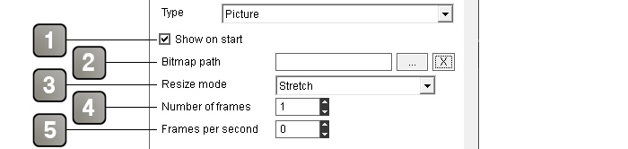
Parameters |
|
1 |
If checked, the element is visible in the interface on startup. |
2 |
Path of the picture file. |
3 |
Resize mode of the picture. - Stretch: Deform the picture to fit the size of the element - Split: Split the picture in 4 and rebuilds it with the correct size - Fit: Fit the picture to the view while keeping aspect ratio |
4 |
Allows to define the number of frame of your picture if it is an animated picture. The number of frame of the animation is defined on the image's width. Example of an animated image with eight frames for the animation.  |
5 |
Animation speed in frames per second. |
Action |
|
Set [element name] path |
Change the path of the picture to use. |
Hide [element name] |
Hide the element and all its children. |
Show [element name] |
Shows the element and all its children. |
"Slider" type
A "Slider" item displays a slider to allow the user to select a value or to be used as a gauge.
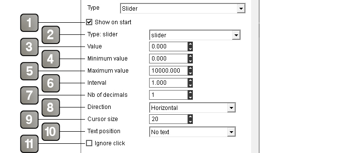
Parameters |
|
1 |
If checked, the element is visible in the interface on startup. |
2 |
Theme element selector. For more details, please refer to the theme element selector documentation. |
3 |
Default value. |
4 |
Minimum value that can be entered in the field. |
5 |
Maximum value that can be entered in the field. |
6 |
Value added or subtracted when the increment or decrement button is used. |
7 |
Number of decimals of the value. |
Slider direction. - Horizontal : the slider is horizontal, with the minimum value on the left and the maximum value on the right - Vertical : the slider is vertical, with the minimum value on the bottom and the maximum value on top |
9 |
Width of the cursor in pixels. |
10 |
Position of the value text. |
11 |
If checked, disable mouse input on the slider (useful when used as a gauge). |
Action |
|
Get [element name] value |
Retrieves the value of the slider. |
Set [element name] value |
Change the value of the slider with the value in the link parameter. |
Hide [element name] |
Hide the element and all its children. |
Show [element name] |
Shows the element and all its children. |
Event |
|
[element name] value |
Returns the selected value of the slider. Can be triggered by the "Get [element name] value" action or a button with the "Validation button" preset. |
[element name] modified |
Triggered when the slider value changes. |
"Table" type
A "Table" item displays a table with a set number of rows and columns that can contain text.
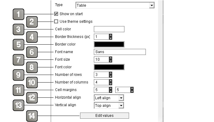
Parameters |
|
1 |
If checked, the element is visible in the interface on startup. |
2 |
If checked, allows you to use theme elements instead of the plugIT parameters. Other appearance settings will be replaced by a theme element selector. For more details, please refer to the theme element selector documentation. |
3 |
Background color of the cells. |
4 |
Table borders thickness (in pixels). |
5 |
Borders color. |
6 |
Name of the text font. |
7 |
Size of the text font. |
8 |
Text color. |
9 |
Number of rows of the table. |
10 |
Number of columns of the table. |
11 |
Horizontal and vertical margins around the text (in pixels). |
12 |
Horizontal alignment of the text. |
13 |
Vertical alignment of the text. |
14 |
Button that opens the window described below allowing to set the default content of the table and the width of each column. |
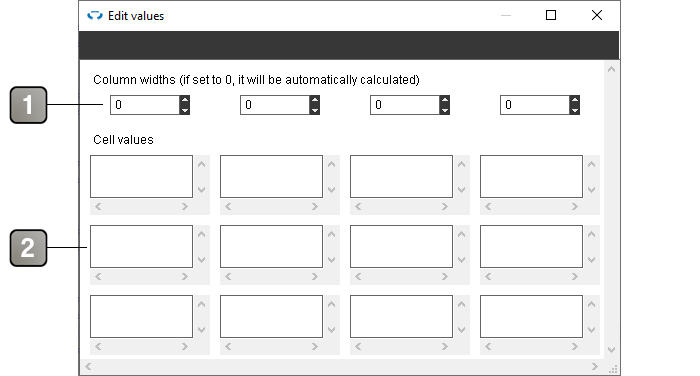
Parameters |
|
1 |
Width in pixels of each column. Columns with a width left to 0 will equally share the remaining available width. |
2 |
Allows to set the default content of each cell. |
About indexes
To retrieve or modify the contents of a cell, column, or row using actions, you will need to designate the cell, column, or row with which you want to interact using indexes (the index of the row being always given before the index of the column when both are necessary). Indexes range from 0 to n-1, where n is the number of rows or columns. The indexes increase from top to bottom for rows and from left to right for columns.
Thus, the cell at the top left will always have coordinates "0 0", and the cell at the bottom right of an array of x rows and y columns will have the coordinates "x-1 y-1".
Example: to access the cell in the 7th row and 5th column, the coordinates will be "6 4".
Action |
|
Get [element name] cell content |
Retrieves the content of the cell of which the coordinates are given in the link parameter (Example: 0 4 to retrieve the content of the cell on the 1st line and 5th column). |
Set [element name] cell content |
Set the content of the cell with the content given in the link parameter after the coodinates of the cell to modify (Example: to put "Hello" in the cell from the 3rd line and 2nd column, the link parameter will be: 2 1 Hello). |
Get [element name] table |
Retrieves the entirety of the table content formatted as CSV. |
Set [element name] table |
Set the entirety of the table content with the CSV-formatted content in the link parameter. |
Set [element name] column |
Set the content of a column's cells with the CSV-formatted content given in the link parameter after the index of the column to modify. |
Set [element name] next column |
Set the content of a column's cells with the CSV-formatted content given in the link parameter. Starts with the first column (index 0) and switch to the next column on each call. |
Set [element name] row |
Set the content of a row's cells with the CSV-formatted content given in the link parameter after the index of the row to modify. |
Set [element name] next row |
Set the content of a row's cells with the CSV-formatted content given in the link parameter. Starts with the first row (index 0) and switch to the next row on each call. |
Hide [element name] |
Hide the element and all its children. |
Show [element name] |
Shows the element and all its children. |
Event |
|
[element name] cell content |
Returns the coordinates and the content of a cell of the table. Can be triggered by the "Get [element name] cell content" action. |
[element name] modified |
Triggered when the content of a cell is modified. Contains the coordinates and the new content of the cell in the link parameter. |
[element name] table |
Returns the entirety of the table content formatted as CSV. Can be triggered by the "Get [element name] table" action. |