
Back to Interface PlugITs content page
"Button" PlugIT
The "Button" PlugIT allows to create a button applied to a scene object which can be activated by a left click, a right click, a middle click, when the cursor is on the button or when the cursor leaves it.
This PlugIT works in multi-touch.
If the button is applied to an object, the object must have a texture. Also check if you have a material assigned on your object.
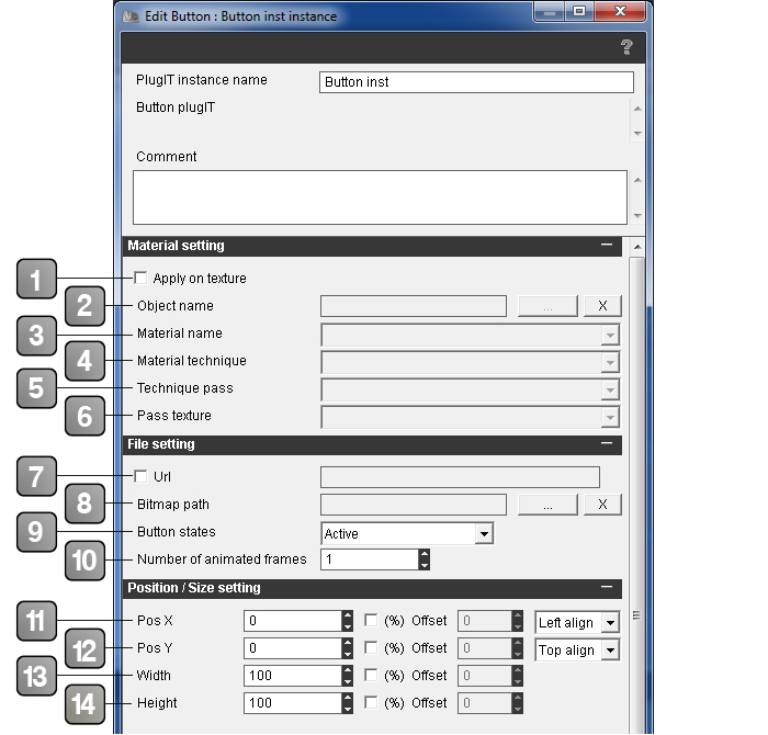
Parameters |
|
1 |
Allows you to set a button to an object. This parameter enables the (2) (3) (4) (5) (6) points and locks the (11) (12) points. |
2 |
Allows to search an object in your scene you want to apply a button. |
3 |
Allows to apply the button on a material. |
4 |
Allows to apply a button on a material technique. |
5 |
Allows to apply the button on a pass technique. |
6 |
Allows to apply the button on a pass texture. |
7 |
Enable/Disable the url use. Use the "http://" url type in the text field. |
8 |
Allows to use an image on your computer. |
9 |
Allows you to choose state of your button. Depending on the states, your image won't be used as the same way. Your image will be divided by N parts relative to the choosing state number on the image height. |
10 |
Allows to define the image number of your button if it is an animated button. The image number of the animation is defined on the image width. Example of an animated image with three states on the height (Active, hover and Down) and eight images for the animation. 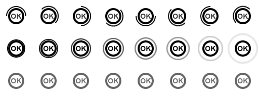 |
11 |
Sets the X position of your button. By default, units are in pixels. But you can check "%" in order to set in percentage and enable the offset parameter; this one is set in pixel and allows to slide your button (here Right to Left). A drop-down list allows to set the button to the left, center or the right directly without using the numerical parameters. The "%" applies on the width of your screen and will deformate your button. |
12 |
Sets the Y position of your button. By default, units are in pixels. |
13 |
Sets the width of your button. By default, units are in pixels.. |
14 |
Sets the height of your button. By default, units are in pixels. |
Parameters (next) |
|
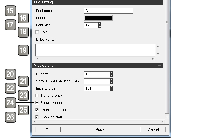
15 |
Allows to choose a typography for your text. |
16 |
Allows to choose a color for your text. |
17 |
Allows to choose a size for your text. |
18 |
Enables/Disables the bold on your text. |
19 |
This zone allows to add text contents in your area. Empty area won't apply any text. |
20 |
Allows to set the opacity value of your image. To the '0' value, the image is totally transparent, to '100' it is non-transparent. |
21 |
Allows to display or hide an image with a transition on opacity parameters. |
22 |
Sets the display order of the image in the scene. Set a value if you have conflict between several images. |
23 |
Enables/Disables the transparency of the PNG. |
24 |
Enables/Disables the mouse. |
25 |
Enables/Disables the "hand" cursor when the mouse pass on the button. |
26 |
Enables/Disables the PlugIT when the application starts. |
Action |
|
Send middle click middle click |
Allows to send a middle click of the mouse from an other device. |
Send right click |
Allows to send a right click of the mouse from an other device. |
Send left click |
Allows to send a left click of the mouse from an other device. |
Set size |
Change the button size. For this, edit the adapted link, adding a value in the form W H (for example 320 200). |
Set position |
Change the button position. For this, edit the adapted link, adding a value under the X Y (for example 10 25). |
Set State |
Changes the button state. |
Disable |
Disables the button. |
Enable |
Enables the button. |
Set label |
Allows to change the text. |
Hide |
Hides the button. |
Show |
Displays the button. |
Change |
Allows to change the image. |
Input |
Coordinates in pixel in the 3D view of the device. |
Set opacity |
Allows to modify the image opacity. |
Event |
|
MouseOut |
Reacts when the mouse leaves the button zone. |
MouseOver |
Reacts when the mouse enter the button zone. |
MiddleClick |
Reacts when you use the middle click of your mouse. |
RightClick |
Reacts when you use the right click of your mouse. |
LeftClick |
Reacts when you use the left click of your mouse. |
Pushed |
Sends when a button is pushed. |
Released |
Sends when a button is released. |
Pushed Move |
Sends when the button is pushed and the user moves the cursor and the finger. The output parameter contains the ratio of the X Y translation relative to the click depending of the button size. |
Started |
Executes an action when an instance starts. |
Shown |
This event is enabled when the button is displayed. |
Hidden |
This event is enabled when the button is hidden. |